Happy halloween.

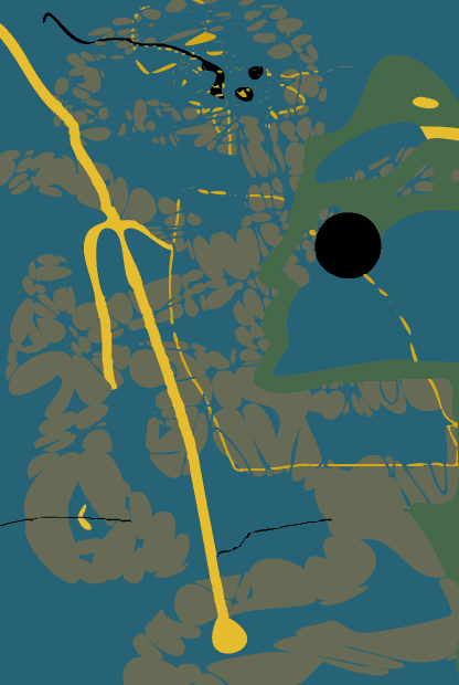
Playing around with illustrator today, using the trace options to make bezier-looking curves around hand-sketched lines. In other news, I don't really know what to do with my life. I might just get a job at a print shop or something like that. At least I'd learn some technical stuff.
I think I should make it a rule that for every entry I have at least 1 image and at least 1 character of text; the worst case scenario would be a single pixel and a single decimal point. Maybe I'll do that tomorrow.
Above I did the same thing with the-day-before-yesterday's abstract image. I prefer the original.
I either don't mind or actually like pixelation, and I like solid colors on solid colors. Pixels in monitors haven't gotten much smaller since the 1980s, but computers fool you into thinking demarcations between graphic areas are smooth by using millions of colors to blend them. This is not only cheating, but it in itself doesn't look very good, I don't think.
I remember in high school the "designer type" artists, doing pastels or chalk, blending and smearing every line and shaded area into an airbrush-like texture until their artwork was like a piece of processed cheese. This is something -- an ethos, a technique -- I sneered at back then, and now I just avoid it without passing judgement on those people (i like to think). I was "raised" on a monochrome mac ca. 1985, doing superpaint and videoworks, and I don't see pixelation as something to be battled, as if to pretend some tools aren't monitor-based.

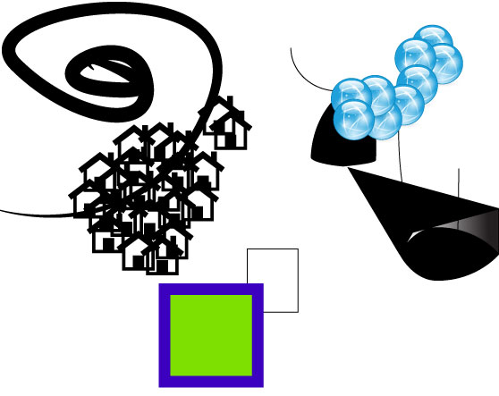
More silly playing with illustrator:

Asdgasdgasd
Asdhasdhadsfh
Asdhashasdfh
Ashasfhafsdh
Ashasfdhxh
October 30, 2011 2:20:49 PM EDT
Asfhasfhxfh

I had another flash of insight: the technological singularity could amount to a job and self-actualization renaissance for those with creative ability, as the cold war and invention of the microprocessor amounted to such a renaissance for the techy mind (and as a consequence, propelled the techy mind into an elevated social position). As computers get smarter, the first jobs they'll take over will be the simpler, more repetitive ones that don't require a lot of planning, fluidity, or creativity, but rather mostly techincal skill. Positions like tollbooth attendant, bank teller, and cashier have already been successfully replaced by robots or computers, and it's a matter of time before more complicated jobs can be done more cheaply and better by thinking machines ("librarian" comes to mind).
It may be that resumés showcasing some kind of creative ability and presenting a "human" side will be more attractive to hiring managers (hiring mahcines?) than those featuring list-form qualifications and skills like the ability to use a particular tool or language; that latter kind of job qualification might become nearly obsolete.
All this -- that there is real, monetary, production value to the creative/right-brained intellect that's perhaps more mysterious, less quantifiable, more "amazing", less reproduceable, and ultimately more valuable than the ability to code in C or analyze fluid mechanics -- is something of a dirty little secret, and I think it's something the geeks and techies have had in the back of their minds all this time that they've been chanting "the geeks shall inherit the earth." it's hard to inheret the earth when a speak-and-spell can do your job better than you.
Computers aren't necessarily uncreative or even unoriginal, but only unwillfull. They can generate things by algorithm, just like people, but they can't direct themselves to do so. Will needs to be simulated with determined response to some input -- for example, a pseudorandom number can be generated and outputted every hour.
The sooner we get humans out of leadership positions, the better off humanity will be. Unfortuantely, the desire for power and to make executive decisions -- to be in control of one's own life -- is a fundamental human quality. I think it will be our downfall, and when that happens I'm going to laugh while it all crumbles into rubble. Every time I see a primate with a self-satisfied grin on its face because it's just made some other primate do something, I think about concealed carry laws.
Man, just when you think "open the windows" season is over, you start to get hot. C'mon winter...I'm waitin' on you. The problem is partly that I'm over-insulated with fat and over-heated with calories. Which reminds me: my diet starts tomorrow. I got a scale and everything. 2500 calories a day, for the rest of my life, per the requirements of a 37 year-old, 6'2"-tall, 194-lb man, who exercises 3 times a week (eep). 194 pounds is the maximum a "statistical person" of my height can weigh without being classified as "overweight." so, I could probably go below 194 lbs, but I want to play it safe.

I'm hungry. Dad arrived yesterday evening, and mom arrived an hour ago. She's on her way up to pick me up for dinner. Convocation is tomorrow, after which we all go out for lunch. They call me "mr. Social status," with my postgraduate degree. That was a big part of why I started my degree program: self esteem, basically. Relatedly, my parents and various other members of my family have grad degrees and it's just sort of "in the culture" to get one.
A grad degree can be an important part of being educated, especially if one is disinclined toward autodidacticism or pratical matters. These days, when a bachelor's degree is considered by many "middle class" people as being a necessity for maintenance of socioeconomic status, and many undergraduate programs are less challenging than they were 50 years go, a postgraduate degree is another way to set one's self apart. Perhaps the postgrad degree is today what the undergraduate degree was in 1960.
I'm not sure how people who drop out of high school are regarded -- not too well, I'd guess. Some drop out, have some grand adventure, get their GED, and go on to get a phd in bioinformatic neurosociology and certificate in modern dance, but maybe dropping out and never finishing is something now reserved for criminals, drug addicts, the mentally ill, etc -- western untouchables. Dropping out of HS and never returning or getting a GED is not a decision any contemporary person with any grip on reality would make under non-dire circumstances. That's a broad qualifier, but you get my point.
I very nearly didn't go to college, as in "get my undergraduate degree." I went right after high school, like everyone has to do, but dropped out after about a month to work, fuck around, and attend community college for around 6 years. Finally I enrolled in and finished up at a 4-year institution after sustaining a head injury and becoming considerably simpler.
When I look back on my dumbassed, rambling undergraduate career, I don't have any personal "should-have-done-otherwise" regrets -- there was no way I could have been successful, even if I had been at another school or taken different classes. I just wasn't ready for school, emotionally or socially...maybe even intellectually. I didn't have the ability to apply myself then. If my relationships had been better and more stable that would have helped, but in large part the problem was my own, like the problem of being 4' tall and unable to dunk a basketball.


That isn't very good. But what if I were to do a new one of those every day, until I got better at it? My main goal is for this blog to be pictorial and image-heavy. I want it by itself to be art-like.

Don't fight the medium. I think, though, that these need to be narrower if they're going to look good in this blog table; more like the first one's dimensions.
3 days til graduation. Parents arrive tomorrow. Here is a pigeon outside my window. They seem to nest or make a rest-stop of the balcony nextdoor, and I can hear them cooing loudly when the window is open. Once, one suddenly flapped over and clinged to the window screen with its claws right next to my head while I was napping. It freaked me out.

Didn't sleep much last night. Going back to bed. I exercised yesterday -- biked all around, from my apartment to the bike shop to the museum to some bike trails to a cemetary to an ice cream store to my apartment. Maybe 10 miles, altogether. Not much compared to what "real" cyclists do, but I either got a little too much sun or over-exercised, and this made me unable to sleep, because I just generally felt weird and sick.
"is it good or is it canadian?"
I've noticed something about english canada (henceforth, when I say "canada," I mean "english canada"): canadians sometimes don't know if a popular cultural product they like is "genuinely good," or if its apparent popularity is only some function of canadian content laws or canadian cultural protectionism. This idea of the latter somehow not counting speaks to a sense of canadian culture being an artificial construct. To some degree, it is -- there are laws in place to make sure distributed media products -- books, tv shows, comic books, songs, etc -- enjoy a certain percentage of "native canadian" origin.
I only have two examples, from which I was willing to extrapolate my generalization. 1) the rock band "rush:" a prof of mine once asked me if rush was really such a big deal, and said that he had assumed that their popularity in canada was some function of canadian content laws. I assured him that yes, rush were big in the usa as well. 2) ryan gosling: I involve myself in this example. The gosling popularity surge happened while I was in london ontario, and I wasn't sure if this was, at least in part, a function of canadians being particularly excited about his being a canadian actor. It turns out ryan gosling is a big deal these days in the usa as well -- the beginnings of another jim carrey, maybe. But it's hard to make that determination of "is this thing big in canada just because it's canadian, or is it big in canada because it's 'naturally big' in the usa and we're just feeding on that phenomenon as undirected consumers?"
Usually, when someone talks about "being canadian" they're talking about being culturally distinct from the united states, beyond an imaginary horizontal line stretching from just-below montreal to just-below vancouver, and queen elizabeth on slightly larger, more colorful money. Oh, and tim hortons. No, just kidding...there are deeper cultural differences between canada and the usa, although they tend to be subtle and open to interpretation (in canada, vs. the usa: less of a fear-aggression dichotomy, more politeness coupled with less friendliness, not as loud or threatening or belligerent, not as "cool", less confrontationality and more of a passive-aggressive coldness and tendency to quietly draw a line through your name rather than under it, perhaps less proneness to black-or-white thinking or extremes of emotion, more repressed, more obedient, some odd combination of shyness and arrogance, a traditionalist sort of social conservatism, an often unflatteringly self-congratulatory sense of having better-developed empathy and tolerance, less individualism and more collectivism, and perhaps other things even subtler and more open to interpretation than those).
But it's funny, and telling, that any attempt to define or describe canadian behavior and canadian products -- to define "canada" as a cultural entity -- ends up in the context of distinctness from americana and america. It's not exactly a dirty secret that distinguishing canadian culture from united states culture is challenging, but rather perhgaps a dirty glaring fact.
Living in canada is like being in an isolation chamber where you never know what's real and what's just canadian. Canadians, over the years, have grown cynical and suspicious of both "canadian content" laws and homegrown, grass-roots cultural protectionism, and find themselves unable to determine a thing's quality on their own and on its own. In fact, a government decree of "this is good stuff" can have the opposite effect, and cause a media product to be regarded as worse than it is.
It's a similar problem to one in the art world, which I think is mostly a symptom of postmodern cultural influence (here we go again, eh?): saying one thing is better than another is taken to be impossible or unethical, so then determining a hierarchy of art becomes a matter of more roundabout analyses like judging the artist, the historical relevancy of the work, or any other kind of associated thing that we can find measurable and open for discussion, while avoiding the "quality" of the art itself. This is the same thing as canadians trying to decide if some hollywood movie or rock band is good or bad: they're just not sure, and wonder if, when a media entity is of canadian origin, it's only popular because it's canadian and not because it's "good." this is sort of a crippling state of mind, and I attribute blame mostly to postmodern nihilism, but also to the canadian government's protectionism and the inherent, historically inevitable similarities between the two countries.
It's hard to "be canadian."

I had to start a new blog page. The last one was getting too big, and the rainbow ascii art in the pre tags somehow widened the main table even though the displaying characters were well under 559 pixels wide. All in all, it was a mess.
Today I decided to experiment with colors-on-colors that don't appear lighter or darker than each other, but get all their difference from saturation and hue (mostly hue -- I think all of the shades above are completely RGB saturated).
What's really interesting, though, is that something about either os x or the way this LCD monitor works doesn't seem to allow a block of color to abut another without drawing a darker line between them. Of course, I don't know what's going on on your monitor when you look at these images I've posted, but when I look closely at the edge of the letters (the effect is most pronounced in the blue, green, and teal letters) I can see one pixel-wide lines that are slightly lighter or darker than the interior fills, and that serve to improve the contrast with the red background.
I can't zoom in to the area with software and see that 1 pixel line of demarcation get bigger (as in, zoom in on the image while keeping same screen resolution with some "zoom" function built into photoshop or an image viewer) -- it's not something my computer is keeping track of at a code level; if I zoom in like that, the higher-contrast border of 1 pixel stays at 1 pixel. However, os x has a "monitor zoom" function built in, that seems to work on another, "lower" level, and truely enlarges what the LCD monitor is displaying. In order to show you what I'm looking at when I use it I'll have to take digital camera pics of my screen:
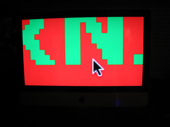

There, on the last image, the darker line dividing the red and the green is clearly visible. What gives, man? I didn't put it there. Complicating things further is the fact that these 1-pixel monitor contrast lines look like they're sometimes darker, and sometimes lighter, when viewed without monitor zoom. However, when I use monitor zoom they are all darker.
Since I'm playing with and thinking about color in this entry, I'll post some more images.

That's red -- a pure, computer monitor, RGB additive color mixture red. In photoshop, it's 100% saturated, 100% bright, and the "red" value is at 255 (the maximum) while the "green" and "blue" values are both at 0.

That's green -- a pure, computer monitor, RGB additive color mixture green. In photoshop, it's 100% saturated, 100% bright, and the "green" value is at 255 (the maximum) while the "red" and "blue" values are both at 0.
Photoshop has a gradient tool, which will fade one color smoothly into another. If we do this with red and green, we see this:

Focusing on the middle, I find myself asking: what color is halfway between red and green? The answer is: red 127.5, green 127.5, blue 0, or this solid shade below, which has the name olive (dark yellow).

If you overlapped two circles of red and green in an RGB color mixing model, you'd get bright yellow. But in a subtractive model, which seems more "natural" to us and is therefore simulated by photoshop when doing gradients, the in-between shade in the gradient ends up as olive. What makes additive color mixing rules different from subtractive ones is that you're dealing with light, not pigment. When you add light to light, it gets brighter, not darker. If you mixed red, green, and blue paint together you'd get mud. On a monitor, you'd get white light if the red, green, and blue were "turned up" on full. In computerland, the world of subtractive color mixing -- of pigment mixing -- is the world of printing. There, the fundamental ink colors are cyan, magenta, yellow, and black -- you may have seen the letters CMYK in use (the RYB -- red, yellow, blue -- primary subtractive/pigment color model, taught to me in elementary art school, is wrong or at least suboptimal; lies my teacher told me). All of these can be mixed together in some way to match any RGB color. However, subractively mixing colors makes the result darker, not lighter. For example, if you were to squirt cyan, magenta, and yellow ink together at 100% flow, you'd get this weird color:

Sort of a greyed-out grape juice. wikipedia explains this better than i can.